Picture this: you have a new product that needs testing, but you have limited resources. Not to mention, there’s a tight-deadline for product development, and your organization has little experience performing formal testing. What would you do?
Heck if I know, but here’s what I did.
Product Background
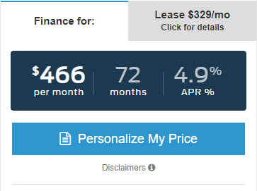
Simply put, APEX (Automotive Purchasing Experience), is a solution to engage car shoppers looking for competitive deal without filling out a long financial application. The product is designed to live on internal Search Results pages (SRPs), Vehicle Details pages (VDPs), or both. The process is designed to make rate comparisons quick and easy. While the value to the our customer, car dealers, is a detailed lead submission based on an end-users location.
My Role
I was tasked with conducting testing for this product due to my background and formal training in usability research. After the UI Designer completed his mocks, and the Front-end Developer completed the coded prototype (HTML, CSS, JS), I took the following steps:
- Defined the testing research methods with stakeholders.
- Set-up testing dates and organized participant testing blocks via Outlook and Slack.
- Connected with the video team to gather the necessary equipment for filming.
- Filmed and interviewed participants.
- Compiled and archived video files on the company shared drive.
- Crafted a user journey map for testing using Whimsical (I could not speak more highly of this service, check it out!).
- Analyzed results and presented testing deliverables to stakeholders via Jira.
Problem
As I eluded to above, this project required a minimum viable product on a tight deadline. Our team focused on planning and design during the front-end development process; the old build-the-plane-as-you-fly-it approach. The process wasn’t ideal, but at least the bulk of the efforts were done before hand-off to back-end developers. The majority of front-end development was desktop focused, so testing on mobile was needed to find out what we missed. With little time and resources, I had to improvise and design a test that would yield the best results.
Testing Criteria
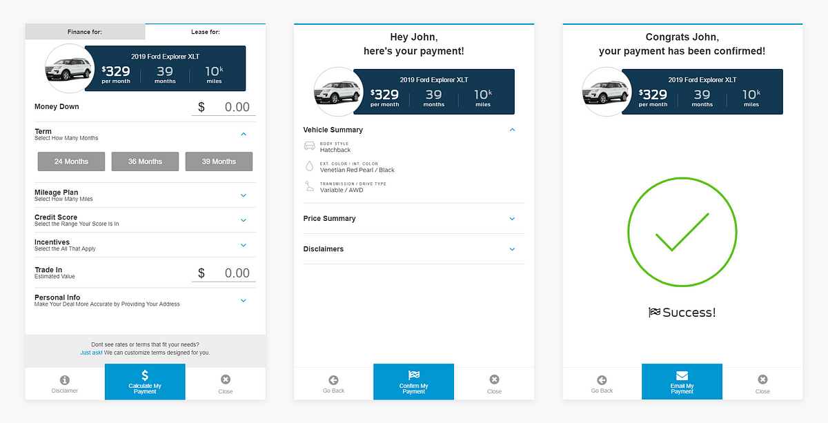
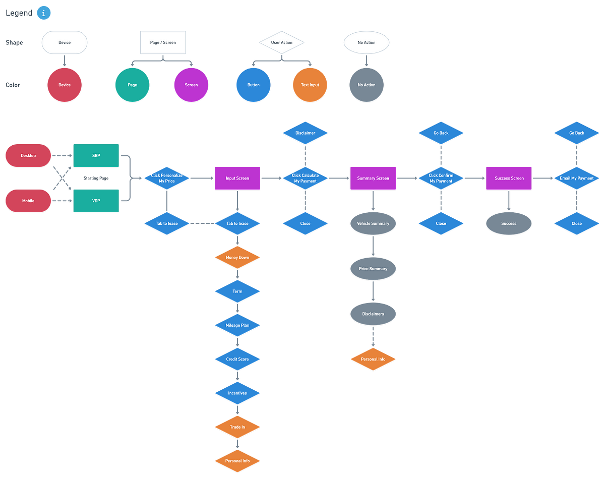
The goal of testing was to see if users could get from point A to point B. From first interaction to lead submission, and to identify the key pain-points in between. I decided to conduct a task analysis to test the effectiveness of the user journey on both Desktop and Mobile. The steps to lead submission were as follows:
- Start on the SRP/VDP
- Click into the “Personalize My Price”
- Input Screen
- Summary Screen
- Success Screen
Research Methods
I decided to test on internal employees because they were free to test, easily accessible, and had limited bias. In order to test across gender, department, device, and starting points I mixed up the groups. Every other participant tested from a different starting point, SRP or VDP. I booked two sets of five participants for two different testing blocks. A group for desktop on the first day, and one for mobile on the second day.
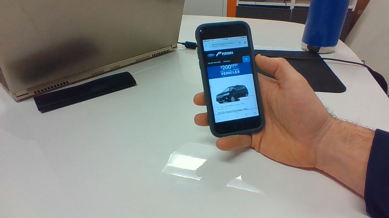
Based on Nielsens law of diminishing returns, I decided to keep the groups to five. For desktop we filmed using a screen-capture software with audio recording. On mobile I did it the old fashioned way. I tilted a laptop screen down and filming participants scrolling through the product. (Side note: I found out later that I could have just used screen-capture on the device itself. Noted for next time!)
In addition to fostering feelings of ownership and involvement internally, participants were more than willing to help for the YouEarnedIt points they got in return for their time. (YouEarnedIt is our chosen “Employee Experience Platform”, where employees can recognize one another across departments and teams in real time.)
Participant Breakdown
- n= 10
- Gender | Males 7, Females 3
- Department | Implementation 4, Design Support 2, People (HR) 2, Inventory 2
- Device | Desktop 5, Mobile 5
- Starting Page | VDP 6, SRP 4
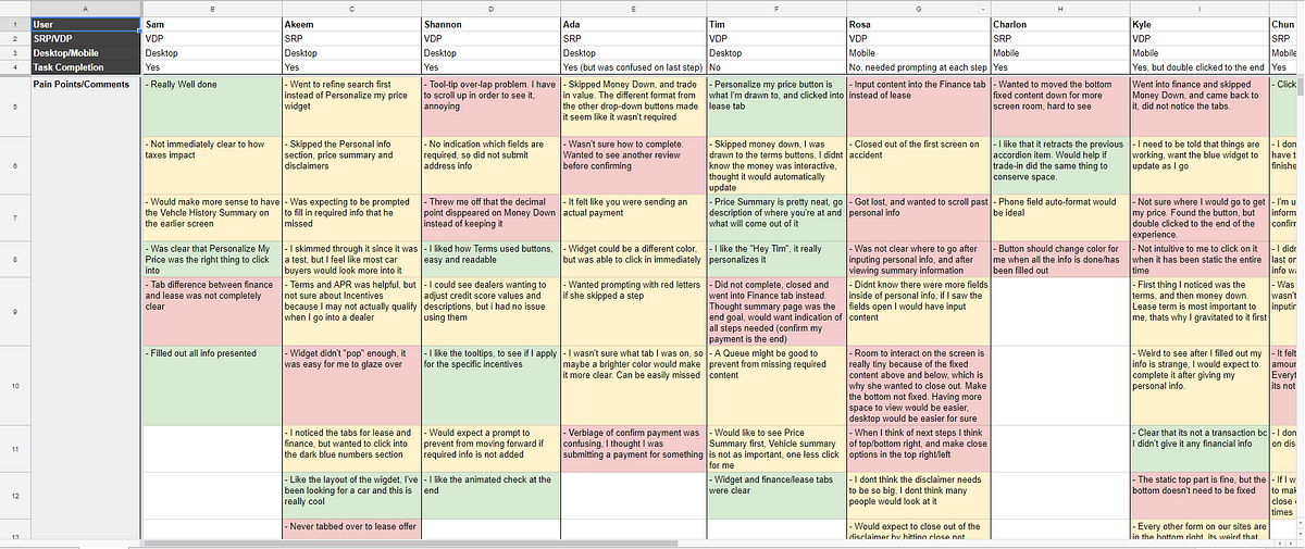
Results
What qualified as completion? Completing a lead submission and receiving confirmation via the final Success Screen.
- 70% Completed the task to completion. Five completed with no friction. One was confused on the last submission, “Confirm My Payment”, but clicked the correct button. One double-clicked the “Calculate My Payment” button to complete, skipping the Summary screen.
- 30% Were not able to complete the task. One closed out thinking the Summary screen was the final step. Another got lost and needed prompting at each screen. A third closed after filling out only the contact information, thinking that was the last step.
Positive Feedback
- 100% were able to identify and use the widget on SRP/VDP on their first viewing. One user filtered the vehicles on the SRP first, but went into the widget upon finding the right vehicle.
- 70% gave specific positive feedback on the look and feel, and the overall usability of the product.
Negative Feedback
- 100% of mobile users commented on the limited amount of interactive screen space. Users preferred to have the the top section fixed. In contrast, the bottom was not seen as needing to be fixed.
- 70% wanted confirmation on their steps to know what to do next, or how far they were in the process. Some users mentioned if the button changed color once all information was added, that would have been more clear. Some commented that if the next step button appeared at the end they would have known to click on it.
Key Findings
Users craved clear and task-oriented feedback.
One of the most common areas of criticism in testing was the lack of intuitive feedback from the product. Although the journey consisted of only three screens, multiple users needed assistance to complete the task at hand. Participants needed additional confirmation that they had completed each step properly, or alerts if they had missed a required field. The product was designed to generate leads, so if users never submitted a lead, the product failed.
Users needed more room to scroll through the experience on mobile.
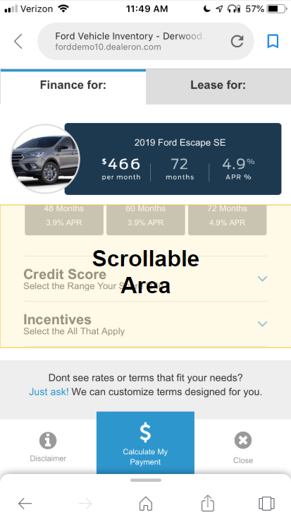
Due to the tight deadline, the product was not designed mobile-first. When we tested on mobile, we found that users were confined to roughly ⅓ of the screen. This was far too limited space to scroll through and interact with the product before submitting their information. Oops!
In addition, the button section location caused confusion for some users. The fixed position of the content made it unclear to users as to what they needed to do next. The section did not appear after inputting their information, instead being visible the entire time. So some users did not realize that they had to select one of the three button options to move on.
The product entry point and visual design was successful and pleasing to users.
More than half of participants provided unprompted positive feedback on the look and feel of the product. All participants were able to identify how to enter the product experience without assistance. Although certain aspects needed refining, the over design served the purpose of attracting users to submit a lead.
Future Considerations
With more resources, time, and managerial support, I certainly would have done things differently. With more time, I’d spend more time on gathering requirements and planning from the get-go to better plan out testing. I might even try Guerilla Testing, or build specific personas to test participants across various age groups. With more resources and organizational support I’d be interested in expanding participant pools with crowd-sourcing services like UserTesting.com. I’d also like to work more closely with the UI Designer to test mocks with animated transitions and interactive functionality. This way we could evaluate usability before front-end development, to avoid wasted resources and duplication of effort.
Working for a young company with a growing focus on user feedback and usability testing has its benefits and its drawbacks. Although my methods for this project may not have been as refined as more mature organizations, I have the opportunity to define what it means to craft solutions and methods that benefit the end-user. I get to learn and experiment with different testing methodologies and make the mistakes that lead to a more refined process. There’s plenty of research to pull from for ideas, and with time, stakeholders will begin to see the true value of user testing.