A digital resource to serve as the source of truth on Palliative Care services and the benefits it offers to patients, family, and caregivers
1. Project snapshot
| Client | Sentara |
| Industry | Healthcare |
| My Role | Design Lead |
| Responsibilities | CX consultation, needs analysis, consumer research, persona development, content strategy, information architecture, UX design, UI design, storytelling, script writing, video creation and editing, design oversight |
| Timeline | 13 mo |
| Team | Creative Director, Project Manager, Design Lead, Service Designer, Research Team, Content Writer, Development Team |
2. The challenge
How can we address the misconceptions associated with Oncology Palliative Care?
Sentara Healthcare needed to establish a digital resource that would provide clear, accurate information about palliative care services. The primary challenge was addressing widespread misconceptions about palliative care, particularly the confusion between palliative care and hospice services. Many patients and even some healthcare providers incorrectly associate palliative care exclusively with end-of-life situations, limiting access to valuable support services for those who could benefit earlier in their treatment journey.
3. research and discovery
Competitive Analysis
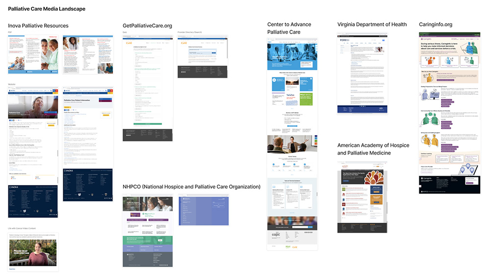
We started by exploring the Palliative Care landscape to understand how resources were currently being used.
Preliminary User Research
Next, we conducted initial testing sessions with three key groups and adapted our format to best fit each group:
- 15 Medical Providers (remote interviews and panel discussions)
- 20 Medical Support Staff (in-person focus groups and panel discussions)
- 3 Patients and 2 Caregivers (in-depth interviews)
Key Findings
From our research, we established that the website needed to:
- Provide a consistent, concise, and unified message about palliative care
- Clearly explain that palliative care is an additional service to improve quality of life
- Distinguish between palliative care and hospice
- Emphasize “care” rather than “comfort” when describing services
- Normalize communications about death, dying, life goals, and wishes
- Present information to patients in a concise manner
- Encourage patients to involve others in their care
These insights served as our guiding strategy when we began our design process.
Persona Development
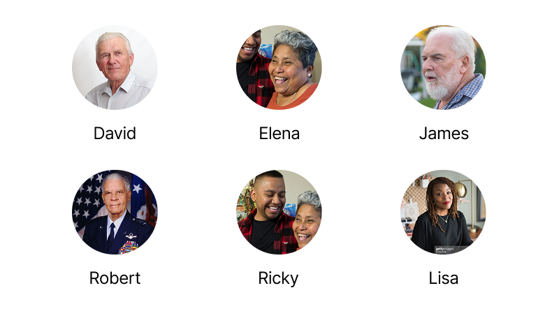
Based on the results of our initial interviews, we developed detailed personas representing the diverse needs of potential website users:
- David: Early-stage lung cancer patient seeking symptom management
- Elena: Congestive heart failure patient needing complex condition management
- James: Cancer patient with frequent ED visits who wants to remain independent
- Robert: Stage 4 pancreatic cancer patient requiring pain management and emotional support
- Ricky: Primary caregiver balancing self-care and caregiving responsibilities
- Lisa: Stage 4 breast cancer patient hesitant about palliative care services
4. Design Process
Information Architecture
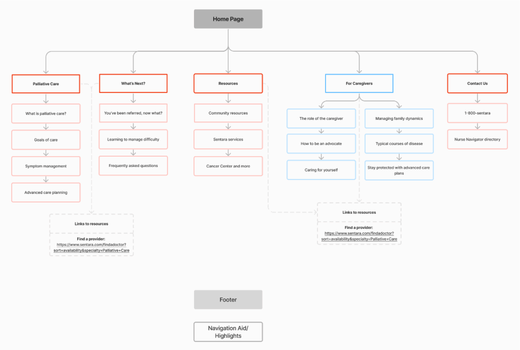
Our service designer created a user-centered information architecture that would guide visitors through a logical progression of understanding palliative care, its benefits, and how to access services. The structure was designed to address different entry points based on user needs and level of familiarity with palliative care.
Design Approach
We adopted a conversational storytelling approach to make complex medical information more accessible and personal. This strategy helped:
- Break down barriers to understanding palliative care
- Create emotional connection with users
- Present information in a clear, approachable manner
- Guide users naturally through their journey of discovery
Wireframes
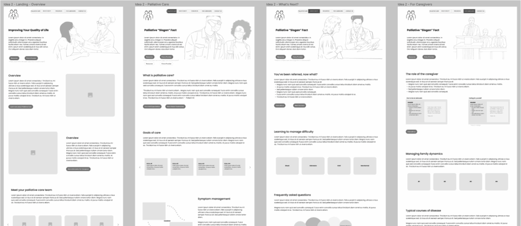
Our wireframes focused on creating clear pathways through the content based on different user needs and scenarios by utilizing:
- Simple navigation structure
- Progressive disclosure of complex information
- Prominent calls to action for finding care
- Balance of text, visuals, and interactive elements
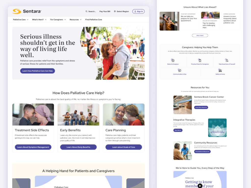
Visual Design and Prototype
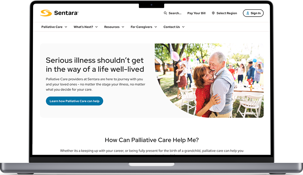
Next, we began adding fidelity to the wireframes we created. The visual design incorporated:
- Warm, reassuring color palette to convey care and support
- Accessible typography and sufficient contrast for medical audiences
- Authentic photography featuring diverse patients and care scenarios
- Clear information hierarchy to guide scanning and reading
- Consistent visual elements aligned with Sentara’s brand guidelines
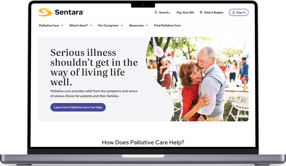
Once we had the core pages in place, we linked them together to form a clickable Figma prototype to allow users to validate our solution. Next was on to testing!
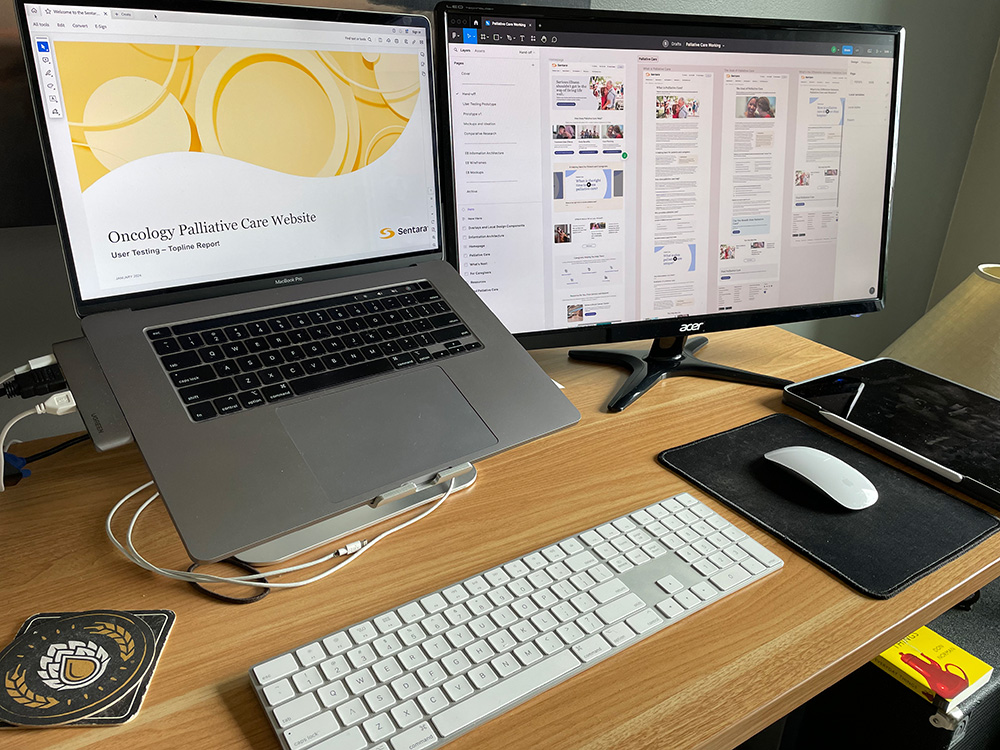
5. user testing and refinement
User Acceptance Testing (UAT)
For UAT, we kept things simple and interviewed three participants, two caregivers (who were also Sentara employees with knowledge of palliative care), and one patient.
Testing Insights
- Users found the layout visually appealing and content well-organized
- Navigation was intuitive and engaging
- Information volume was substantial but not overwhelming
- Content quality was rated excellent
- Users envisioned practical applications, such as using the site as a resource for resistant patients
- One user stated they would be “100% comfortable” referring potential patients to this website
The results were overwhelmingly positive, and we were able to incorporate the critical feedback we received around the need to break-up content with more engaging elements.
Post-testing Refinements
We made the following changes after UAT:
- Updated the design to align with current Sentara design standards
- Implemented new ways to break up written content with more engaging elements
- Improved the “Find Palliative Care” call to action by guiding users directly to locations and resources by region
- Developed multimedia content to enhance engagement
6. Content enhancement
To make the content more personal and engaging, we decided to film our own provider interviews. This was a big challenge for me personally. I did some video work in college, but nothing professionally. So we picked our interviewees, wrote up our scripts and planned the shoot. I even did a last minute run to the grocery store to get what we needed for hair and make-up. Shooting took place over the course of a few days, and I spent the next few weeks doing to video editing. In the end we came back with:
- 5 short video clips highlighting different aspects of palliative care
- 1 in-depth written patient testimonial interview
- A “Meet the Team” video featuring palliative care specialists introducing themselves and explaining their approach
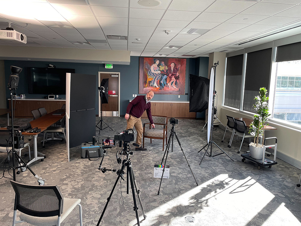

These multimedia elements helped introduce members of the palliative care team and services while providing alternative ways to consume information beyond text.
7. Development and launch
Once we got final approvals on the design, we handed-off our materials to development. During the development phase, I provided design oversight to ensure the final implementation matched our design vision. Key activities included:
- Regular design reviews with the development team
- Quality assurance on responsive behavior across devices
- Verification of accessibility compliance
- Content placement and formatting guidance
- Final acceptance testing before launch
In addition to the launch of the website, we also assisted the marketing department in designing matching brochures to make available across all Sentara Palliative Care offices.
8. Results and reflections
The launched website successfully:
- Provides clear, consistent information about palliative care services
- Effectively distinguishes between palliative care and hospice
- Offers pathways to care based on individual patient situations
- Presents testimonials and expert perspectives that normalize palliative care conversations
- Creates an accessible resource that healthcare providers can confidently recommend to patients
Reflections
I could not be more proud of what came out of this project. So, to conclude, I’ll refer back to a journal entry I wrote on the day of launch, October 2nd, 2024. I think it sums it up best:
We officially launched the Palliative Care website yesterday.
It’s wild to think it’s finally out in the world. It took over a year. It’s the biggest project of my career to date.
I was reading Daimon’s message to the company in Slack celebrating the accomplishment, and I was struck by how much we did. It’s easy to lose the forest for the trees when you’re in the thick of it.
“Cx consultation, consumer research, persona development, needs analysis, content strategy, information architecture, UI design, UX design, storytelling, script writing, and video creation and editing”… and I was involved in all of it. Even down to the video editing, and content strategy. Crazy.
I can’t help but recognize, and reflect back to, the connection I felt to the project when I started last summer.
The connection of my own story – being raised in a home with a mother battling cancer. As a family, we utilized palliative care services, hospice, and eventually lost her to the disease. I like to think that connection comes through in how welcoming, warm, and real the site feels.
The same hands that drew in a coloring book during chemotherapy appointments are the same hands that designed the website.
Cancer shaped my life. It hits different knowing that I was able to be of service in this way, and I’m grateful to be of use.