A brand identity refresh for a vital NICU family support organization
1. Project Snapshot
| Client | Miracle Babies |
| Industry | Non-profit |
| My Role | Art Direction and Design |
| Responsibilities | Brand strategy, logo design, visual identity system, brand guidelines |
| Timeline | 5 mo |
| Team | Creative Director, Art Director (Me), Designer, Design Intern, Project Manager |
2. The Challenge
How can we create a brand identity to communicate “we’re here with you and your family through what may be one of the hardest parts of your life”?
Miracle Babies, a non-profit organization based in Southern California, needed a brand refresh that would better reflect their mission of supporting families during their Neonatal Intensive Care Unit (NICU) journey.
The organization faced several key challenges with their existing brand identity:
- Lack of visual clarity and immediate recognition
- Identity elements that didn’t effectively convey their core values of compassion and support
- Need for a more inclusive visual language that would resonate with diverse populations
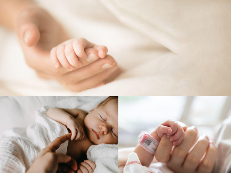
- Desire to move away from traditional “baby”/“hands” visual clichés and gendered color schemes
3. The Audience
Through stakeholder interviews and audience research, we identified that Miracle Babies serves:
- Primarily mothers and families with infants in the NICU
- A largely female audience, including support roles (nurses, social workers, etc.)
- Diverse populations speaking various languages (English, Spanish, Haitian-Creole, Ukrainian, etc.)
- Various socioeconomic backgrounds
- Various education levels
4. Research and Discovery
Brand Audit
We began with a comprehensive audit of the existing brand assets, communications, and touch-points. This revealed inconsistent application of visual elements and messaging that didn’t fully capture the organization’s impact and values.
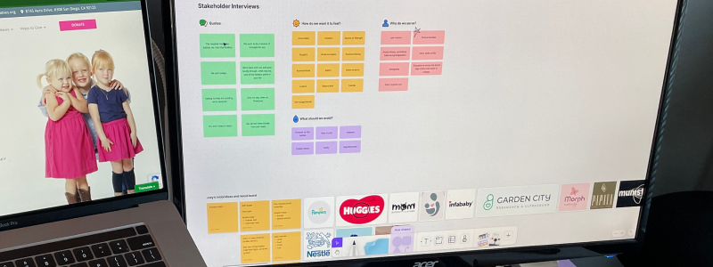
Stakeholder Interviews
Conversations with the Miracle Babies staff helped us understand their vision for the organization and what they felt was missing from their current brand identity.
Key insights:
- Clarity: Simple, strong, clean lines, and easy to understand elements
- Trust: A professional and serious impression, while remaining empathetic and warm
- Connection: Representing the bonds between mother and baby, support networks, and community
Competitive Analysis
We examined other non-profits in the maternal/infant health space to identify gaps and opportunities. This helped us determine how Miracle Babies could visually differentiate itself while still communicating its core mission effectively.
5. Strategic approach
Based on our research, we established a strategic framework that would guide the rebrand:
- Mission-Focused: Center the visual identity around Miracle Babies’ mission to empower families during their NICU journey
- Authenticity: Create visuals that reflects the real, sometimes imperfect nature of the NICU experience
- Inclusivity: Design with diverse families in mind, while avoiding stereotypical baby imagery
- Warmth & Support: Develop a visual language that conveys nurturing without being overly sentimental
- Clarity & Consistency: Ensure all brand elements work together harmoniously and are easy to implement
6. Design Process
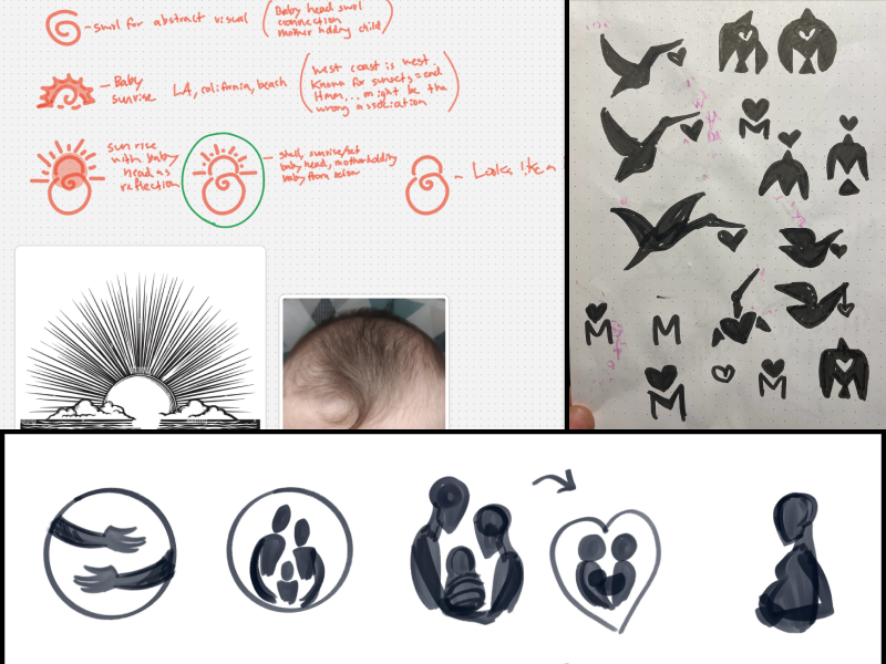
Exploration
We explored dozens of different options, drawing inspiration from diverse sources to find the perfect visual representation for Miracle Babies’ mission and values:
- Cultural and Historical References: Mother archetypes throughout history and mythology, examining how different cultures have historically symbolized maternal care and protection
- Natural Elements: Sunlight patterns, dawn imagery, and natural growth metaphors that represent new beginnings and hope
- Tactile Connections: The importance of touch in infant development and bonding, particularly for NICU babies
- Craft and Community: Traditional quilting patterns that represent diversity, community support, and the “piecing together” of resources and strength
- Familiar Symbolism: Storks and other migratory birds that have traditionally represented birth and new life across cultures
- Geometric Abstractions: Simple forms that could represent connection and support without being literal
Each exploration was evaluated against our strategic framework to ensure it would effectively communicate the mission of Miracle Babies while resonating with their audience.
Concept Development

Next, we refined our direction down to three distinct concepts:
- Holding Baby
- Inspired by a baby’s laughter and the feeling of holding a child for the first time
- Emphasized joy, sensory experience, and trustworthiness
- Highlighted the profound impact of touch for newborns
- Used clean, flowing lines to capture the intimate moment of connection
- Unique Quilt
- Inspired by storks in flight, community quilts, and Ukrainian folk art
- Incorporated “MB” letterforms using the existing “Comforta” font
- Represented hope, community, and uniqueness
- Created a visual metaphor for “piecing together” support systems for families
- Sun Baby
- Inspired by sunrise, new life, and possibility
- Celebrated the beauty in imperfection through hand-drawn elements
- Captured the serenity of a sleeping baby
- Combined the universally positive symbolism of the sun with the gentle curve of an infant’s profile
Design Refinement
After presenting the initial concepts, we received the strongest response to the Sun Baby direction. This concept resonated with stakeholders because it:
- Evoked warmth and gentleness while remaining distinctive
- Offered symbolic representation of new beginnings
- Featured a simple, flexible mark that could work across various applications
- Provided a meaningful visual metaphor for the organization’s work
- Connected sunlight with the southern California sun
7. The solution
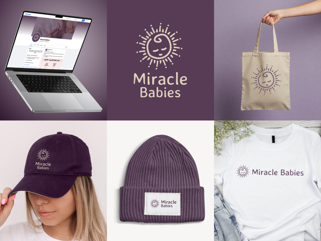
Logo System
The final logo system centered around the Sun Baby mark – a simple yet evocative illustration that combines the imagery of a rising sun with the gentle curve of a sleeping baby’s profile. This duality perfectly captured the organization’s focus on new beginnings and infant care.
We developed multiple logo variations to ensure flexibility across applications:
- Logomark (Sun Baby icon alone)
- Vertical version
- Horizontal short, for a condensed layout
- Horizontal long, with Sun Baby on the left
- Horizontal long, with Sun Baby in the middle
Color Palette
We established a thoughtful color system featuring:
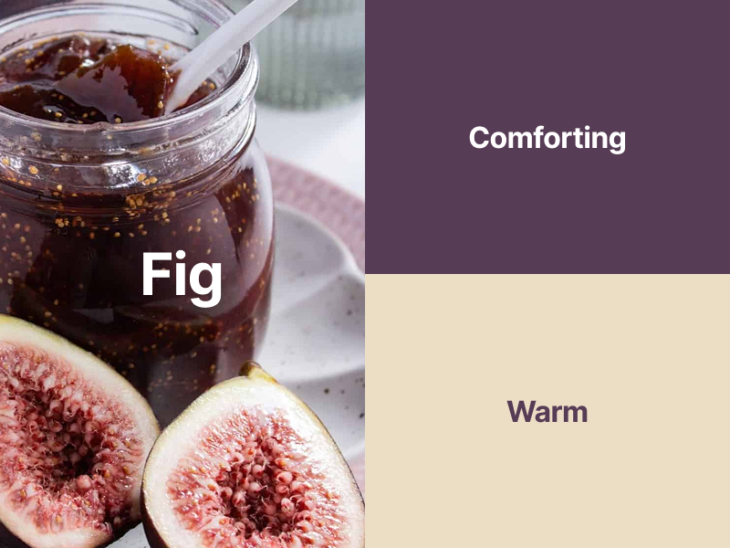
- Primary Fig (Hex: #573C55): A rich, warm purple representing comfort and the protection of a loving caregiver
- Secondary Cream (Hex: #ECDDC5): A soft, neutral tone evoking warmth and the feeling of a soft blanket
This color combination:
- Moved away from traditional gendered baby colors (blue and pink)
- Created a sophisticated, calming impression
- Provided sufficient contrast for accessibility
- Offered versatility across digital and print applications
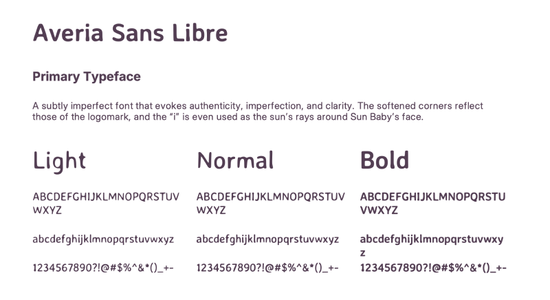
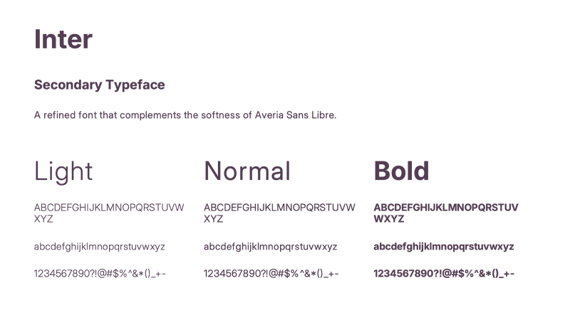
Typography
We selected two complementary typefaces:
Headings: Averia Sans Libre – A subtly imperfect font that evokes authenticity and clarity. Its softened corners reflect those of the logomark, with the “i” even being used in the sun’s rays around the Sun Baby’s face.
Body: Inter – A refined, highly legible sans-serif that complements the softness of Averia Sans Libre and ensures readability in body text.
Brand Voice & Messaging
Consistent brand voice:
- Empathetic
- Warm
- Supportive
- Inclusive
- Clear
Key messaging pillars:
- “We are here with you”
- “You’re not alone”
- “Support through the hardest moments”
- “A community that cares”
8. Implementation
Brand Guidelines
To wrap it all into a single deliverable, we created a comprehensive brand guide to ensure consistent application across all touchpoints. These guidelines covered:
- Brand Overview (mission, vision, values)
- Voice and Messaging
- Logo Usage
- Color Palette
- Typography
- Imagery
- In-Context Applications
In Context
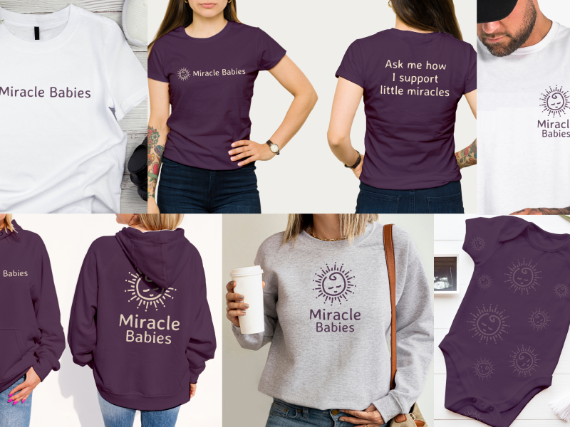
The new brand identity was implemented across various touch-points:
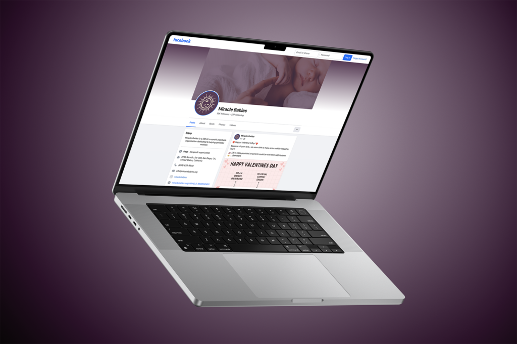
- Website
- Social media templates and profile graphics
- Print collateral (brochures, business cards, letterhead)
- Environmental graphics for their Super Hero 5K Walk
- Merchandise and promotional items
9. Results and Reflections
The rebrand was met with enthusiasm from both internal stakeholders and the community Miracle Babies serves:
- Enhanced Recognition: The distinctive Sun Baby mark provided immediate visual recognition
- Improved Communication: Clearer brand messaging helped articulate the organization’s services
- Stronger Connection: The warm visual language created a more emotional connection with audiences
- Better Consistency: The comprehensive guidelines ensured uniform presentation across all channels
Reflections
The Miracle Babies rebrand demonstrates how thoughtful design can help a vital organization better connect with the communities they serve during one of life’s most challenging moments.